
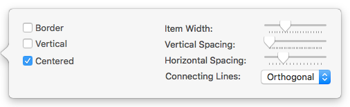
This is the control panel for the current Chart view:
- Border. Default: un-ticked. If ticked a thin border is drawn around each item on the chart. XML setting. XML setting: hasBorder.
- Vertical. Default: un-ticked. If tick-ed, the chart is drawn from top-to-bottom of the screen as opposed to the default left-to-right layout. XML setting: isVertical.
- Centered. Default: ticked. If un-ticked, the item top aligns (default layout) or left aligns (vertical layout) with the line from the parent item. XML setting: isCentered.
- Item Width. Scrubber control sets the width (pixels) of chart items, including icon, title and elements in between. XML setting: itemWidth.
- Vertical Spacing. Scrubber control sets the amount of vertical y-axis spacing (pixels) between chart items. XML setting: yspace.
- Horizontal Spacing. Scrubber control sets the amount of horizontal x-axis spacing (pixels) between chart items. XML setting: xspace.
- Connecting Lines. XML setting: lineType. A pop-up with possible values:
- Orthogonal. (Default) Lines interconnecting items are drawn using horizontal and vertical sections.
- Straight. Lines interconnecting items are drawn using straight lines.
- Curved. Lines interconnecting items are drawn using bezier curves.