
[First introduced in v6.0.0]
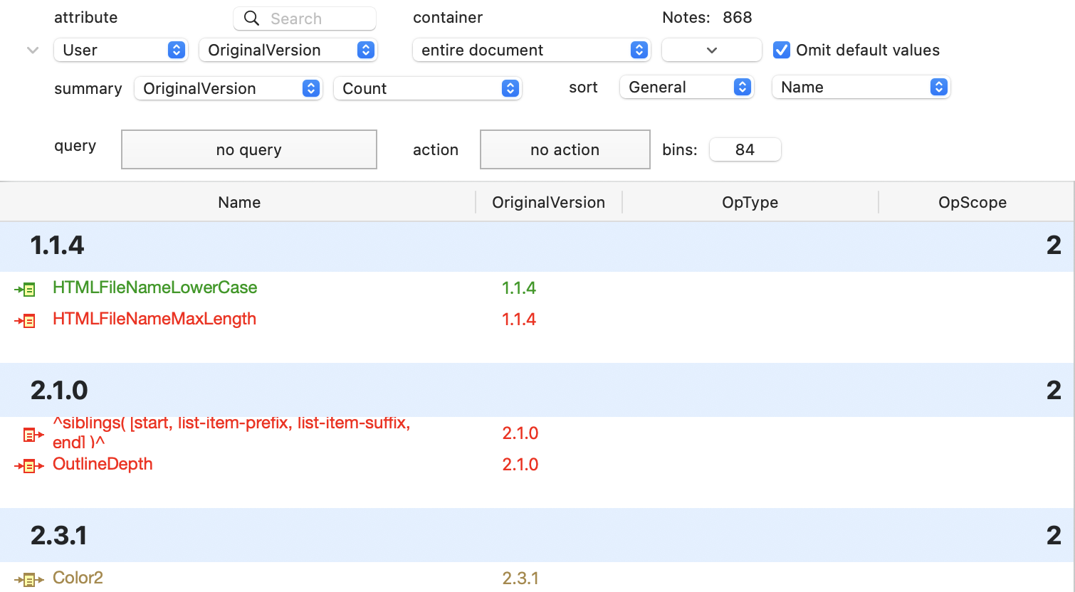
The Attribute Browser shows you the contents of any container in the current document, categorised by the values of a chosen attribute. By default the scope is whole-document. The scope is shown in the right-hand pop-up in the top row of controls in the view's toolbar. By default, all except the first row of controls are hidden. The remainder of the controls can be revealed/re-hidden via a disclosure triangle on the control panel.
The scope and appearance of the view are set via the Attribute Browser controls at the top of the view pane, which includes a search pane for looking up attributes. If a tab using another view type is switched to Attribute Browser view, the scope remains the same. See more detail about all the Attribute Browser controls.
The first column, is labelled $Name but always shows $DisplayName (except during editing).
The view's header (the settings area) displays the count of notes in the scope of the current view. If the same note appears in multiple groups, the note is counted separately in each group.
View font. The name column uses the same font ($NameFont) and type size ($OutlineNameSize) as used in the outline view at standard magnification.
The Attribute Browser will not display notes that are (currently) separators.
The view accepts View menu Magnify and Shrink commands (and shortcuts) and scales rows appropriately.
Selected notes may be copied, regardless of whether the selection is an individual note or more than one note.
Display of rows and columns
Items listed are drawn in $Color and show $Name. Badges are shown, and a link-drag widget is shown after the item name. The icon used for each item is as per Outline view, indicating the degree of text, recentness of edit and in/outbound links.
A link widget for dragging links is drawn at the right side of the selection highlight in the view pane.
From v11.7.0, rows can use $OutlineBackgroundColor to tint their row's background, consistent with Outline View.
In addition to the selected attribute, additional columns may be added to display other system or user attribute values for that note.
From v11.7.0, Tab/Shift-Tab navigates between columns in the selected row.
From v11.7.0, text-based attribute values may be elided in narrow columns. Hovering the cursor over the field shows the full value as a tooltip.
From v11.7.0, Column widths can be auto re-sized. Double-click at the right edge of a column header to set the column width to the width required by the current data.
From v11.8.0, columns now remember their widths, even if the list of columns is edited or the tab is changed.
Category Summaries
For attribute data types that support multiple values, e.g. Set and List, notes are grouped for every unique list value present. Thus a note with more than one value may list several times, once under every discrete value in that note's list. Formerly, this behaviour applied to Sets but not to Lists.
Optionally, value groupings can show a count of the number of the items (configured via the view's controls). By default, this is the per-group count for the view's chosen attribute. It can also be for any of the attributes additionally displayed via column view. If the count is enabled, this summary figure is shown at the right end of the category bar.
Items can be assigned new category (attribute) values by dragging them into different categories. The attribute changed is the one being categorised in the view pane. For single value attributes, a drag replaces the existing value. For list-based attributes the new vale is added to existing values. Notes can also be dragged into empty categories (i.e. with no current items listed, and into no value categories. In the latter case the existing value(s) are deleted.
From v11.7.0, when the table is wider than the display area, summary values are now drawn at the right edge of the display area, and not the right edge of the table. This ensures category counts remain visible if many columns are used in the view.
The colour of the per-category banners uses a tint of the OS's colour choice (i.e. as used for selected controls). For a default, light mode, system that colour is blue.
Editing titles
From v11.7.0, attribute values are editable. The view recategorises and reloads itself after editing the value of an attribute. Undo is available when editing column data in the attribute browser.
When editing the first column, the edited string switches to $Name. The $DisplayName is again shown after the edit is confirmed or cancelled. Some attribute data types show a modified display:
- Boolean attributes show as an (editable) tick box.
- URL attributes show a URL button (to open the URL in a web browser)
- Colour attributes show a colour well indicating the actual colour that is set.
Multiple records can be selected at a time, aiding use of stamps and quickstamp in this context.
Formatting: see Attribute Bowser controls for formatting of attribute values in the table, and per data type options.
Dragging a note to a new category changes the note's value for that listed attribute to that of the category. For multi-value attributes, regardless of the category the dropped note receives all of the values for the attribute for the note listing after the dropped note. In such circumstances it can be useful to list the attribute as a column view item to see the full range of values allotted.
More information:
- Attribute Browser controls
- Attribute Browser column pop-up
- bin configurator for String-type
- bin configurator for Date-type
- bin configurator for Number-type
See also—notes linking to here: